Ralliart is a brand of racing cars, created by Mitsubishi in 1972. The company’s high-performance automobiles are highly respected and popular in the motorsport industry.
Meaning and history
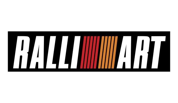
The Ralliart visual identity policy is based on simplicity and distinct lines. The Ralliart logo is composed of a bold and confident wordmark with a graphical element between the two words of the nameplate.
The wordmark in all-caps is executed in a condensed italicized sans-serif typeface, which boasts clear and neat lines. The three letters “LLI” create a construction of three parallel lines, which is being continued by the logo graphics.
The Ralliart emblem comprises ten parallel lines, which are inclined and divided into two groups of five lines each. The lest part features a red color, while the right one — orange.
Placed inside a black rectangular, the white lettering of the nameplate looks strong and fresh, while the red and orange lines are too thin and create a sense of lightness.
The parallel lines of the Ralliart logo are a perfect reflection of speed and moving into the future. They show the brand as progressive and developing, with huge energy.
The Ralliart logo is simple yet bright and recognizable, telling us a lot about the brand and its values.


